Freedom Debt Relief - Prospect Experience
Freedom Debt Relief helps people with their debt above $7,500 in a quicker and less expensive way.
The prospect is the offer/program estimate page that serves as the climax of the 'top of the funnel' flow. A user goes through a series of questions to analyze their situation and see if our program is a good fit.
This section of the product is an integral part of the conversion process. Here, the user will see an overview of the following:
- The program offering
- Paths to take
- Value propositions
- Testimonials
- Tools
We believe that this section will help our prospects understand the program better when they talk to our debt consultants who will call them to discuss their situation and Freedom Debt Relief's value.
Role:
Sr Product Designer - Lead Individual Contributor
Product Manager:
Shilpa K
Tools:
Figma
Background
After several iterations, the Product Team has finally decided to include some tools to help the users discover Freedom Debt Relief's value themselves before talking to our sales agents.
BUSINESS PROBLEM:
Original version had a low conversion rate in terms of enrollment
Users were not engaging with the calculator tool
They were not scrolling through the page
CONSTRAINTS:
Retain visual design from Lead Flow
It should be a single page design as we know from previous versions that users don't go through page-to-page
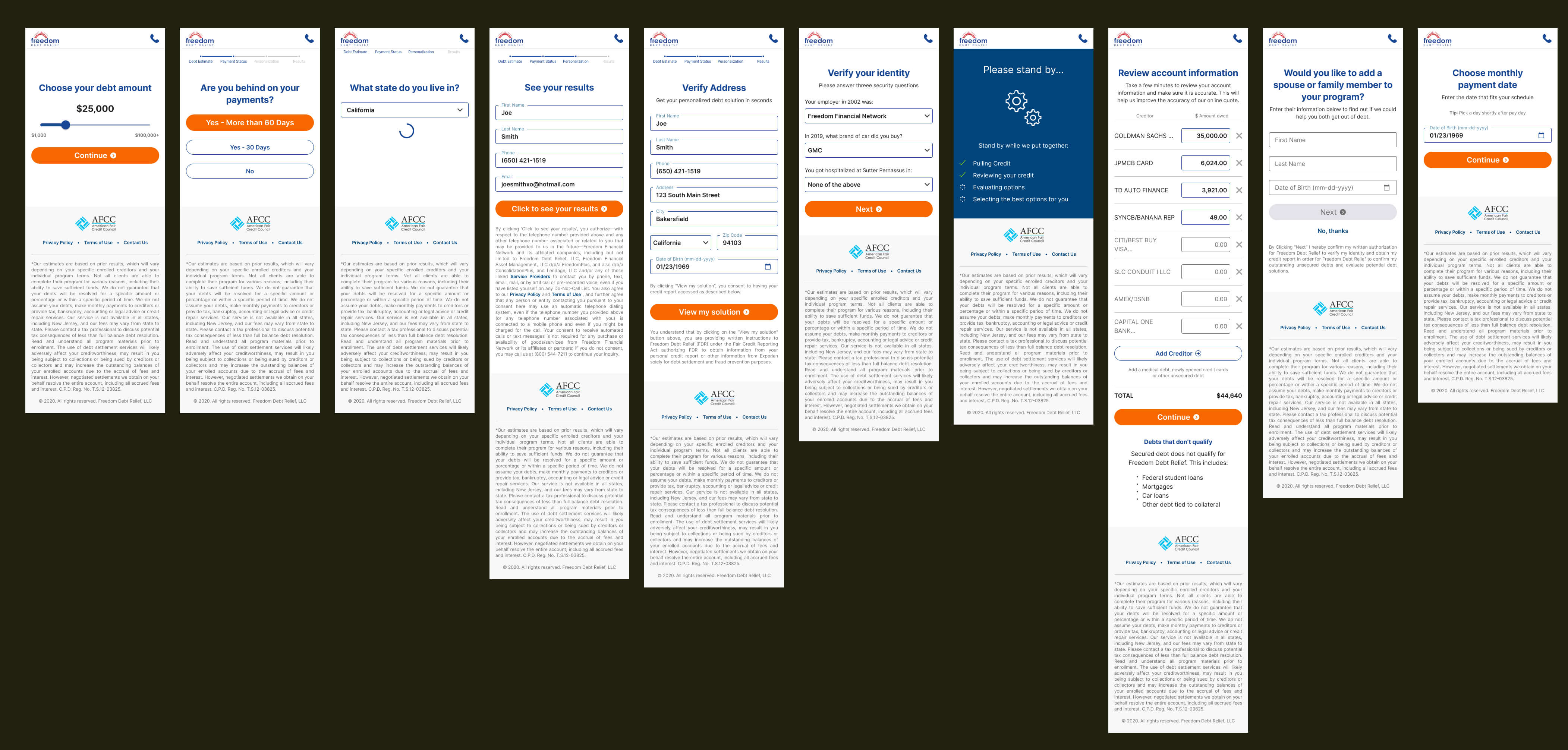
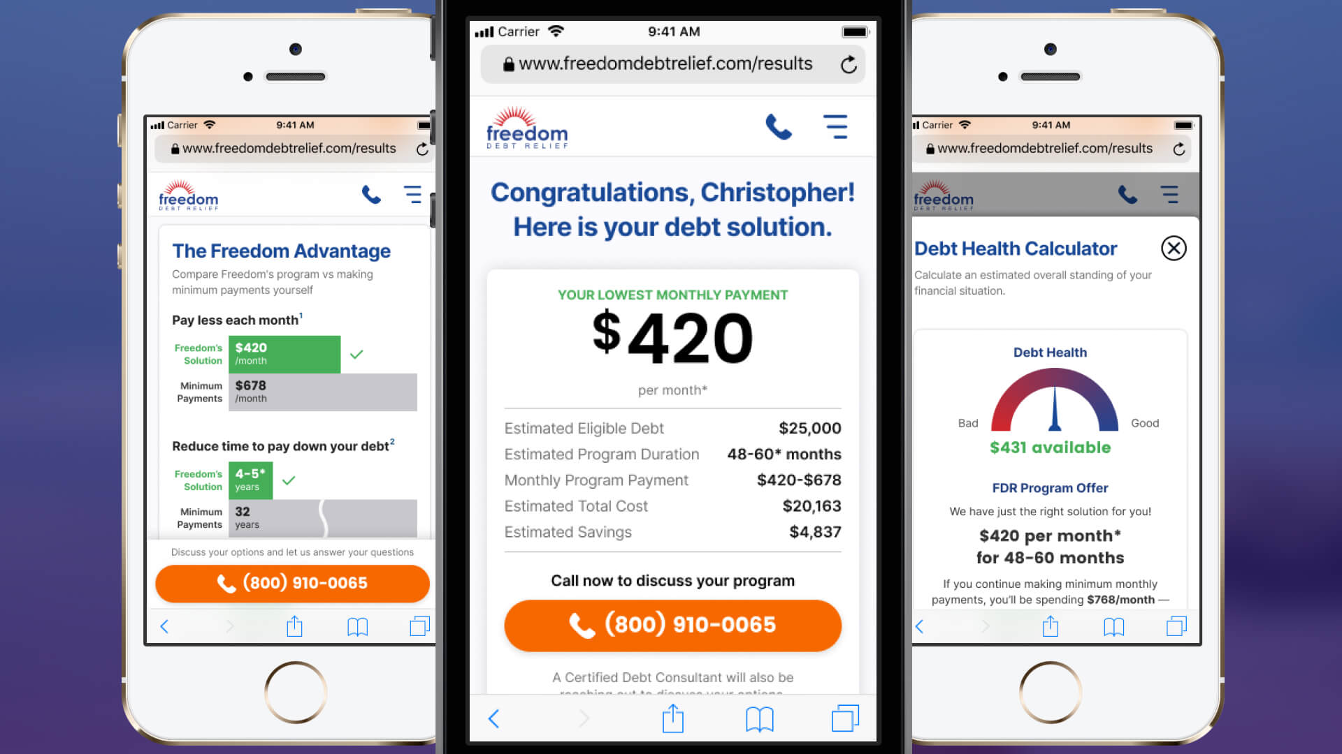
The lead flow helps our system find the right path for your debt problem based on the information you entered.
At the end of the lead flow, the user is taken to this product — The Prospect Experience
People Problem
SURVEYS & FEEDBACK BUTTON: When they get to The Prospect Experience, users still don't know how the program works and want to know more
INTERVIEWS: We know that tools are valuable to them when it comes to finances but we need to make it extremely simple for them to use and appreciate
Our users want to be primed and ready before speaking with our sales agents.
Discovery
Persona
Users with debt above $7,500 but are incapable of paying
In high stress
Has income but unable to pay the minimum amount
Objective & Key Results
OBJECTIVE: Engagement - we want the users to scroll and click through the different tools and content that are available for them on this page.
KEY RESULT:20% improvement on scroll through, event clicks and average time on site
OBJECTIVE: Conversion - our conversion metric is their successful talk with our sales agent
KEY RESULT:10% lift in contact rate - a prospect answers the call, calls the phone number, or schedules a call
Assessment
Let's take a look at the original design and some learnings from them.
Version 1.0
The main section has 3 cards that the user can view and scroll. These represent 3 solutions and added confusion.
Based on our Hotjar results, only 25% of the traffic scrolled below the viewport.
As a multi-page experience, we had so much reliance on the navigation menu hidden in a drawer component.
A lowly 18% ever clicked on the menu button and even less clicked on a different page which was mostly 'Client Reviews' (surprisingly).
Version 1.6
This was one of my first projects when I joined the company.
We tried to expose the links via a horizontal scrolling nav bar component attached to the header - also didn't work. We also decided to simply give them 1 solution vs 3.
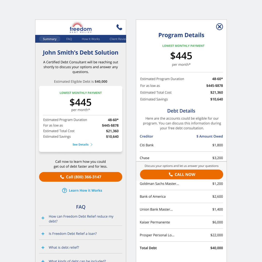
To drive views to the 'Debt Details' we tried to add it to a full page modal sheet from the "See Details" link in the card. This worked well with an 83% click through the modal component.
The inside pages didn't get much visits despite having an accessible and prominent, scrollable navigation bar.
We also incorporated a sticky CTA that did not perform as intended.
Version 1.7
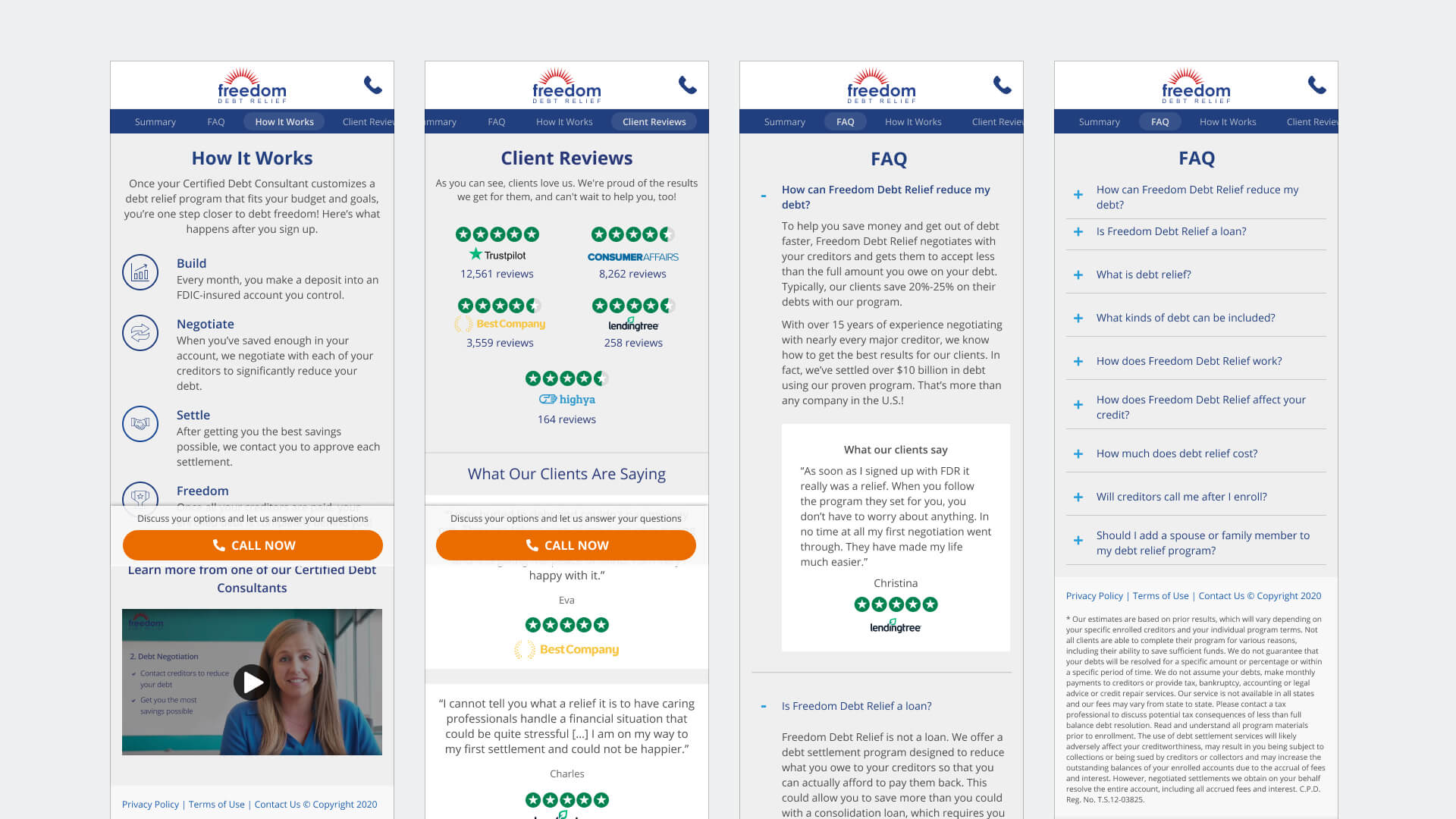
After some user tests, we decided to do a single page approach with an accordion component on the different sections.
We agreed to do an incremental approach in introducing the different sections to the page starting with these 3 Your Debt Snapshot, What Happens Next and What Our Clients Say.
This release produced some successful results: better scroll through below the viewport at 75% and at least 65% of visits opened a content section.
Solution Ideation: V2.5
With the success of 1.7, we built on the single page experience to introduce more content and tools, testing each one with each release until this last version that I worked on.
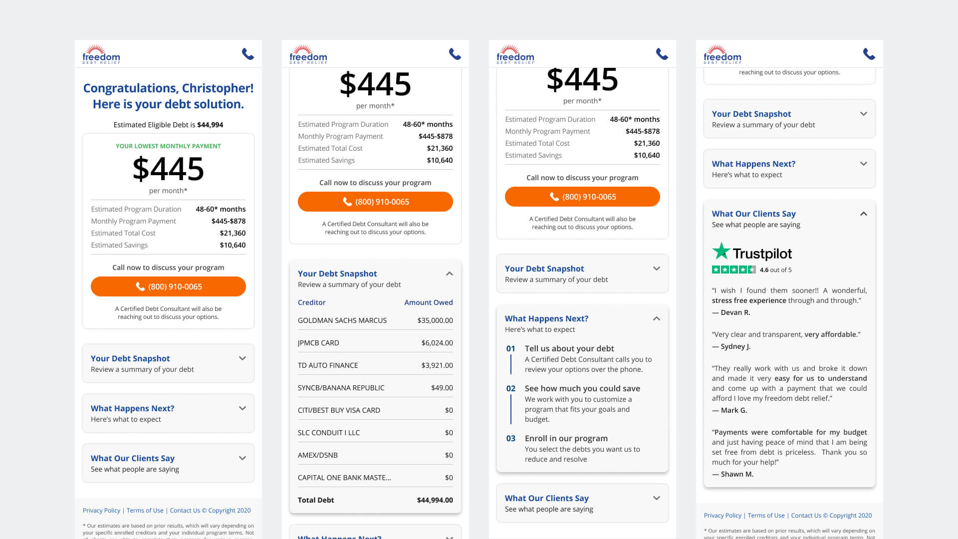
The single offer card with the CTA above the viewport worked very well in previous iterations and was carried through this version.
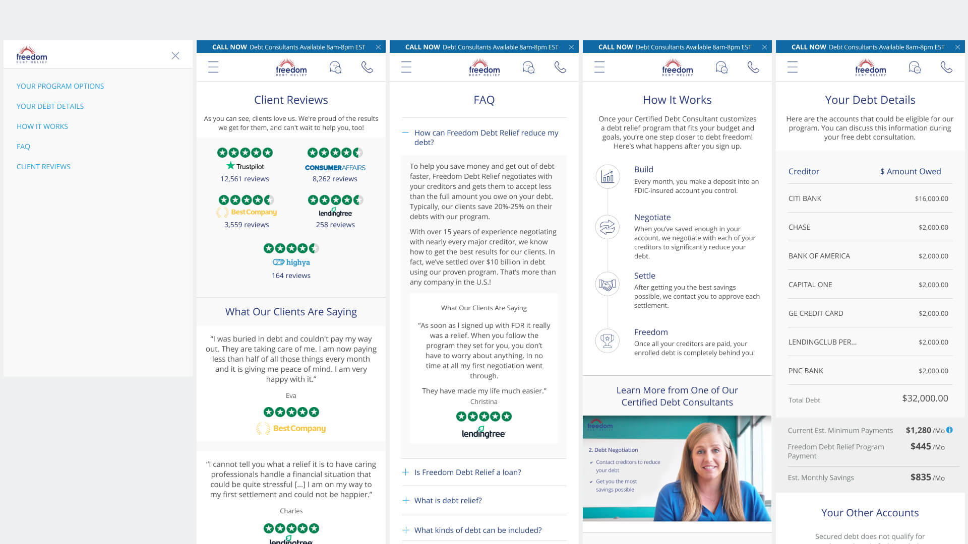
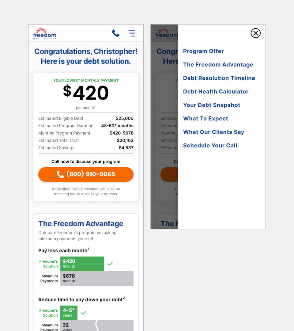
Despite the single page experience, we still needed a navigation component for users to quickly jump through the different content. The hamburger menu to a nav drawer was still the most accepted pattern in our tests. The links anchor to the different sections within the page.
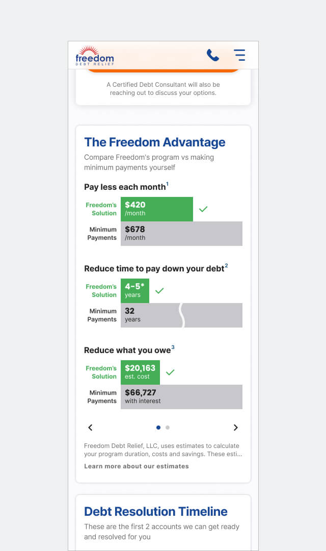
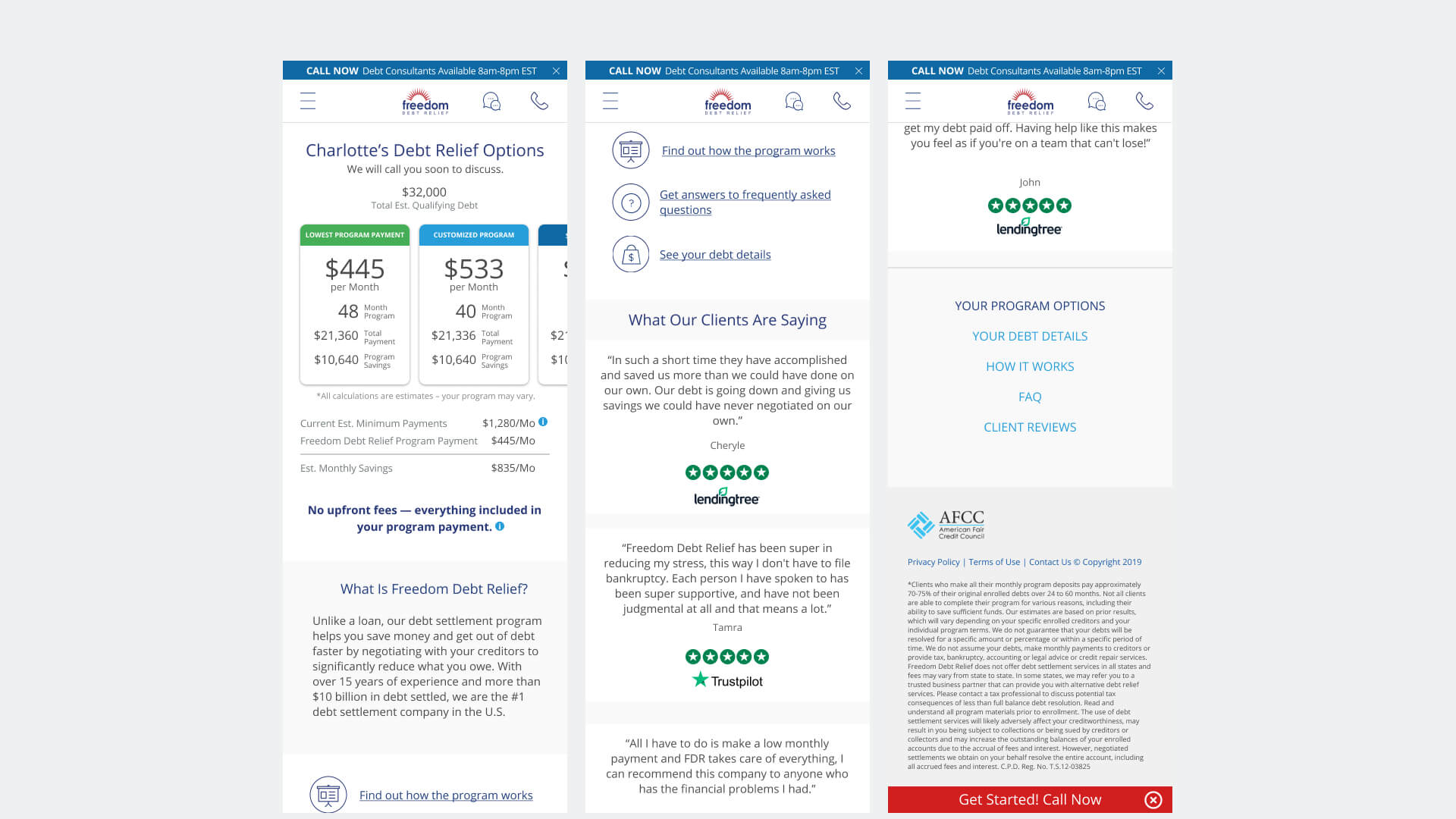
One of the most successful content that we produced that gave a 20% increase in contact rate with a 12% lift enrollments: The Freedom Advantage — an overview of their financial situation compared to the Freedom program.
It's our forefront piece of information. If we can only get one thing the user to takeaway from this page it is this.
At first load, the bar graphs animate from left to right.
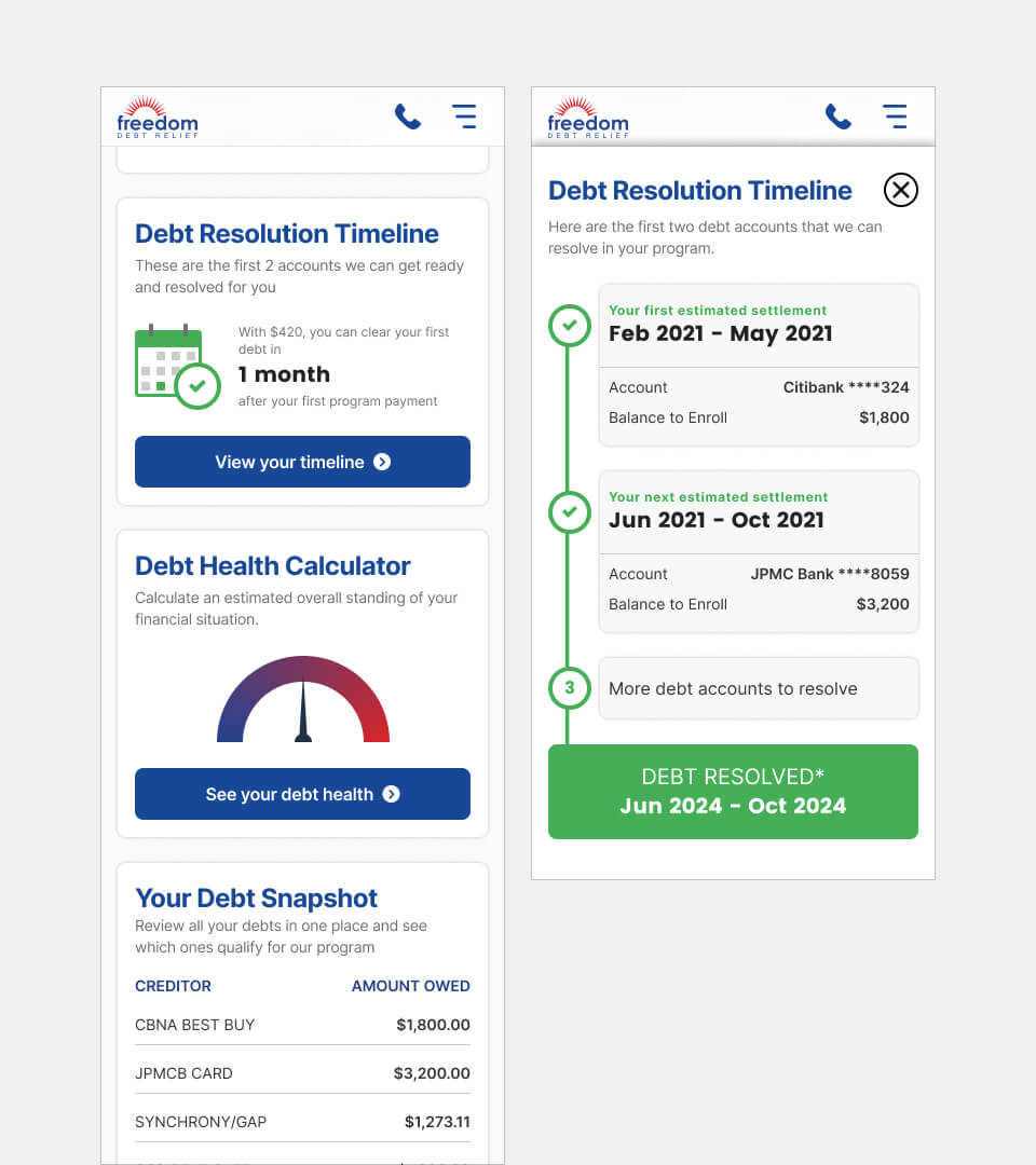
Using the modal sheet that was successful in version 1.6, a timeline estimate was one of the content that our users really appreciated.
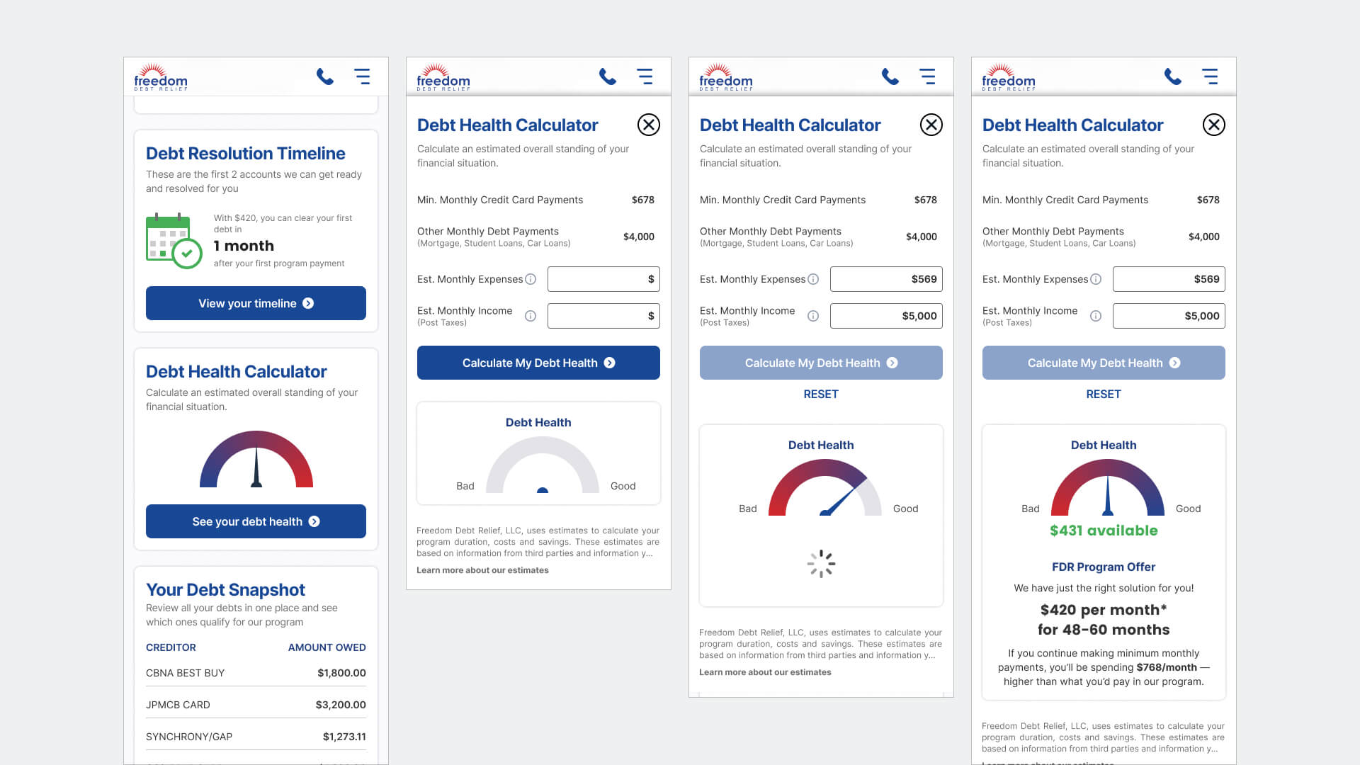
Another successful tool that came about from our user interviews was this simple calculator to show our users if they have available funds to successfully complete our program.
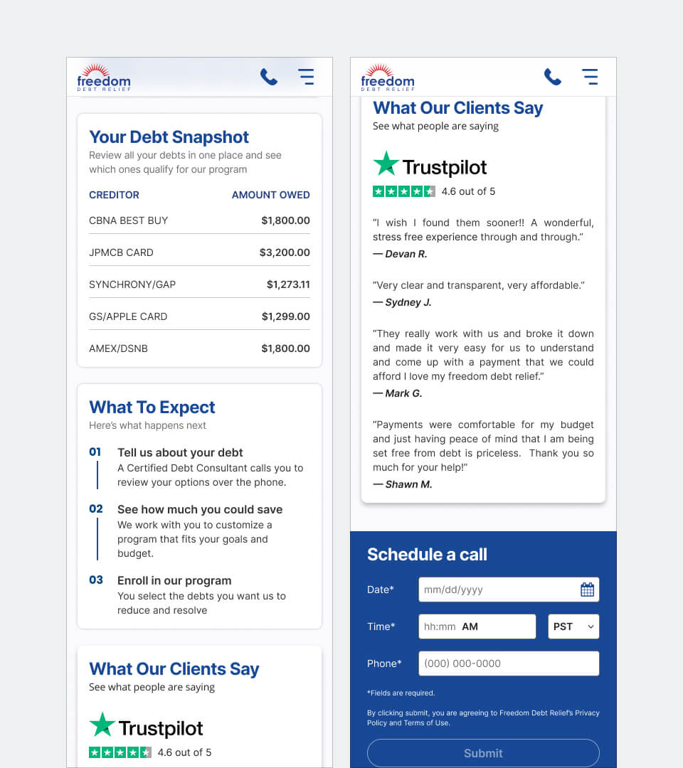
Our other sections include: Your Debt Snapshot — we're legally required to show you the credit card debt we pulled from your credit report in the lead flow.
What to Expect — just a quick overview of how simple the program works.
What Our Clients Say - we continued to show this as it was successful in previous iterations.
Schedule a Call — one of our most requested features based on our user interviews.
Prototyping
This was our mobile prototype for user testing and official release.
Results
The Prospect Experience is the product of a 1.5 year iterative process with continous A/B testing, user research and testing. We methodically planned and carefully decided on what content to feature and release as this was the "Oh Shit!" moment for our prospective clients.
After 3 months upon release, we saw this product peak at 12% contact rate and and 6.5-7% enrollment rate month over month. It was one of the most successful products that I worked on with Freedom. I left the company shortly after we shipped V2.5.